
Updated: 2023-09-02
The color density of your printed images can make or break the final look, that’s true! Printer ink density and saturation are like the secret spice in printing process. They control how vibrant and rich the colors appear on paper. In this article, we’ll explore three fascinating aspects of this topic: the sceince behind ink density, how saturation affects printing. And also various techniques and tools used in the industry.
From understanding difference between coated and uncoated paper to diving into the world of color porfiles and color separations, we’ll uncover magic behind quality print. Whether you’re a print expert or just curious about how your favorite magazine cover comes to life, there’s something here for you.
Table of Contents
- What is Printer Ink Density?
- What Does Saturation Do When Printing?
- Understanding Color in Printing
- Paper and Printers
- The Printing Process
- Materials and Design Phase
- Wrapping Things Up
What is Printer Ink Density?
Definition and Importance
Ink density, my friends, is all about how much ink is laid down on the paper. Think of it like painting a wall. Too much paint, and its looks gloopy. Too little. And it’s patchy. The same goes for printing. Ink density controls the darkness or lightness of the printed colors, and it’s crucial for a quality print.
Standard Ink Density in Printing
So, what’ s the standard ink density in printing? It’s usually around 1.4 to 2.0 for coated paper and 1.0 to 1.5 for uncoatde paper. These numbers might not mean much to you. But they’re like the golden rules for print experts. Stick to these. And also you’re on right track.
Maximum Ink Density
Now, what about the maximum ink density? That’s the highest amount of ink that can be applied without causing problems like smudging or over-saturation. It’s usually around 2.5 to 3.0, depending on paper type and pirnting process. Pushing the limits can create a darker circle of color, but it’s fine line to walk.
High Density Ink
High density ink? It’s ink with more pigment. More pigment means richer, more vibrant colors. It’s like tunring up volume on your most favorite song. But just like music, too much can be overwhelming. Balance is key.
What Does Saturation Do When Printing?
Definition and Role
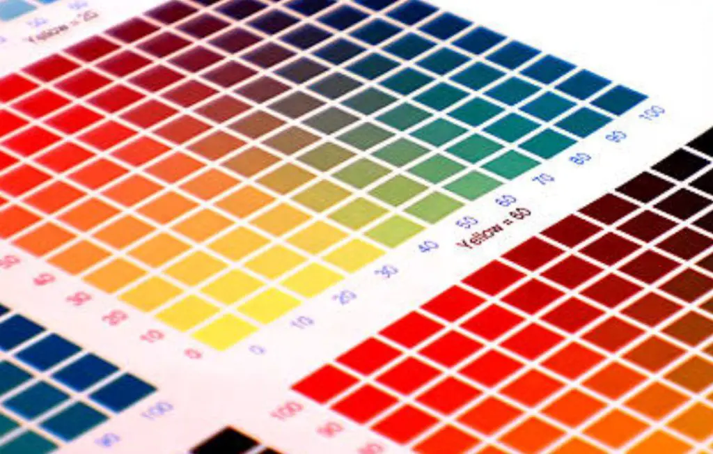
Saturation, dear friends, is all about the intensity of color. Imagine a bright red apple. That’s high saturation. Now think of a pale rose one. That’s low saturation. In printing, saturation contorls how vivid or muted colors are. It’s vital part of color balance.
Is Higher Saturation Better?
Is higher saturation always better? Not necessarily. It depends on what you’re printing. A vibrant marketing flyer might need high saturation. But a vintaeg photo might look better with a softer touch. It’s all about matching saturation to image in print.
How to Increase Print Density
Want to increase print density? You’ll need to adjust the color settings in your pirnting software. It’s a bit like tuning guitar. You tweak color channels, color space, and color values until everything’s just right. A print expert can guide you, or you can experiment on the own.
100% Saturation Color
100% saturation color is like the full throttle of color. It’s bold, it’s intense. And it’s not for faint of heart. It can make a statement, but its can also be too much. Like acup of coffee, it’s best used selectively.
Understanding Color in Printing
Color Separations
Color separations are like building blocks of color in printing. They break down an image into basic ink colors (usually cyan, magenta, yellow, and black) to create full range of printbale colors. It’s bit like mixing paints to get perfect shade.
Color Profile
A color profile is like recipe for color. It tells the printer exactly how to mix ink to match colors on your screen. Without it, your beatuiful blue might come out green. It’s a paramount part of the color workflow.

Selective Color
Selective color is cool trick where only certain colors are highlighted. And also the rest is black and white. It’ s like putting a spotlight on a single color. It’s a creative way to add emphasis and can be done through color adujstment in the design phase.
Color Balance
Color balance is all about harmony. It’s ensuring reds, greens, blues, and every other color are in pefrect sync. Like well-rehearsed band, where every instrument plays its part. Mess it up. And whole image can look off.
RGB Colors
RGB colors are the colors used on screens. They’re made by mixing red, green, and blue light. In printing, they have to be converted to ink colors, which is a whole various ball game. It’s like translating song from one langauge to another. Tricky. But doable.
Color Channels
Color channels are like the individual tracks in a song. Each one controls a different color. And also tgoether teyh create the final image. They’re vital part of the color readout and can be adjusted to fine-tune the final print.
Color Gamut
The color gamut is the range of colors printer can produce. Think of its as printer’s vocabulary. Some prniters have a wider range of colors, while others are more limited. Just like comparing grand piano to a small keyboard. Both can make music, but one has more notes.
Color Space
Color space is like the playground for colors. It defines the boundaries and rules for how colors interact. Different color spaces (e.g. sRGB or Adobe RGB) have various rules, and choosing right one is crucila for a quality print.
Paper and Printers
Paper Type (Coated, Uncoated, Recycled)
Paper type matters, my friends. Coated paper is smooth and glossy, perfect for sharp images. Uncoated paper is rougher and more natural, great for softer look. And recycled paper? It’s eco-friendly choice. Each one affecst how ink colors appear.
Inkjet Printers vs. Laser Printers
Inkjet printers vs. Laser printers is like comparing apples and oranges. Inkjets use liquid ink and are great for photos. Lasers use toner and are faster for text. Both have their pros and cons. And also chosoing right one depends on your print jobs.
Paper Size and Quality
Paper size and quality matter too. Bigger isn’t always better, and right size depends on what you’re printing. Quality print needs quailty paper, whether it’s glossy for photos or heavy for brochures. It’s like choosing the right frame for painting.
The Printing Process
Ink Coverage
Ink coverage is how much of the paper is covered with ink. Too much. And its can smudge. Too tiny, and its looks faded. It’s a delciate balance, controlled by the color settings in printing software. Like seasoning a dish. Just right amount makes it perfect.
Color Settings
Color settings are the controls for how printer mixes the ink. Just like adjusitng the bass and treble on your stereo. You can tweak the color balance, color channels. And also color space to get the sound—er, I mean, the colors—just right.
Color Adjustment
Color adjustment is like fine-tuning guitar. You tweak color values, color readout, and color worfklow until everything’s in harmony. It’s an art and a science. And it takes a print expert to get its just right.
Blocks of Color
Blocks of color are large areas of single color. They can be tricky to print because any tiny mistake shows up big time. It’s like sinigng a long, high note. It takes skill and control to make it sound great.
Color Readout
Color readout is like sheet music for color. It tells the printer exactly how to mix ink to match colors on your screen. It’s a paramount part of the color workflow, and without it, your beautiful blue might emerge green.
Print Jobs
Print jobs are tasks you send to the printer. Whether it’ s single page or a whole book, each job has its own stetings and requirements. Just like cooking meal. Each dish needs its own ingredients and cooking time.
Print Production
Print production is the whole process of turning a digital file into a physical print. From artwork file to final trimming, it’s complex dance of technology and craftsmanship. Like buildnig a house, one brick at time.
Print Quality
Print quality is the measure of how good the final print looks. It depends on everything from ink denstiy to the paper type. It’s like judging a cake. It has to look great and taste good. And also every detail matters.
Resolution Print
Resolution print is all about the sharpness and clarity of the image. High resolution means more detail, like a high-definition TV. It’s crucial for a qualiyt print, especially for photos and intricate designs.
Materials and Design Phase
Gloss Papers
Gloss papers are shiny and reflective, like a mirror. They make colors pop and are great for photos and flashy marketing materials. But they can be too much for everyday use. Exactly like wearing tuxedo to the groecry store. Stunning. But not always appropriate.
Black Plate, Key Plate, Metal Plate
In printing, plates are used to transfer ink to paper. The black plate is for black ink, the key plate is for aligning the colors, and metal plate is durabel option for enormous print runs. They’re like the tools in a mechanic’s garage. Each one has its purpose.
Artwork File
The artwork file is the digital blueprint for print. It contains all details, from the color spearations to layout. Exactly like script for movie. Every word, every pause, every detail is planned out.
Production Process
The production process is the journey from digital file to physical print. It’s complxe dance of technology, craftsmanship. And creativity. From the design phase to final trimming, every step has to be perfect. Like baking a soufflé, one wrong move, and it can all fall flat.
Maximum Ink Coverage
Maximum ink coverage is the most ink you can wore paper without causing problems. Just like filling cup to the brim wtihout spilling. Too much. And also it can smudge or bleed. Too little, and it looks faded.
Darker Circle vs. Lighter Circle
In printing, a darker circle means more ink. And a lighter circle means less. It’s a visual way to unedrstand ink density. Think of its like shades of coffee. Some people like it strong and dark, others light and mild. It’s all about personal taste.
Wider Range of Colors
A wider range of colors means more options and more creativity. It’s like having a bigger box of crayons. More colors mean more possibilities, whether you’re desinging a logo or printing a family photo.
Color Density
Color density is concentration of ink on the paper. Like the flavor in a dish. Too much, and it’s overpowering. Too tiny and also it’s bland. Finding the right blaance is key for a tasty – er, I mean, a beautiful print.
Single Color vs. Color Bands
Single color is one solid color, while color bands are stripes of different colors. Both have their uses, from bold blocks of color to subtle gradients. Just like choosing between solid shirt and striepd one. Each has its own style.
Color Workflow
The color workflow is process of managing color from screen to print. Exactly like followign map on a road trip. You have to know the route, the landmarks, and rules of the road to get where you’re going.
Color Values
Color values are specific numbers that define a color. It’s like the DNA of color. Every shade has its own unique code. And it’s used to assure color is consistent across various deviecs and prints.
Wrapping Things Up
So, ladies and gentlemen, that’s the printer ink density and saturation in a nutshell. From science of color to the art of printing, it’s a fascinating journey that turns pixels into paper. Whether you’re print expert or just curious about how your favorite magazine cover comes to life, I hope you’ve found somethign captivating here.
Remember, printing is not just about pushing a button. It’s a craft that combine technology, creativity, and skill. So next time you pick up printed page, take a moment to appreciate the magic behind it.