Updated: 2021-07-15
What are the smallest margins that should be adhered to when printing on a printer?
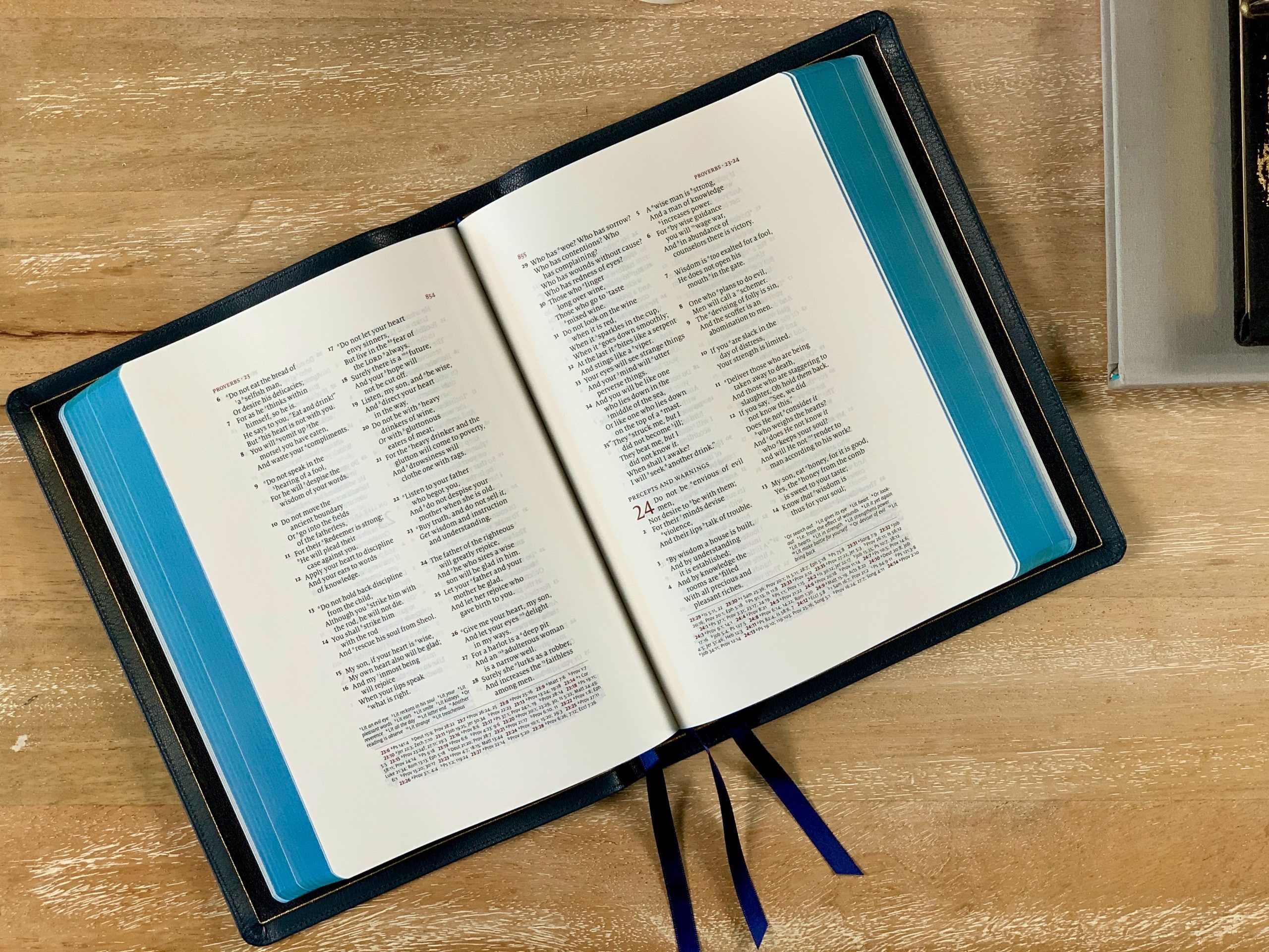
How big the margins should be on a printed page is a bit of a battle between reading comfort and space saving. While we don’t want to include too much white space in our prints, some minimum margins are necessary in order to maintain some basic reading comfort and decent print quality.
As far as margin dimensions are concerned, there are no exact rules to follow. However, in general, for a comfortable reading experience, the printable area should have a margin at least, as, without margins, the reader will feel trapped within the page.
Different readers will perceive the page differently
It is important to remember that the reader will read a document or page in a variety of ways.
- Since the reader can hold the printed page in his hand when he reads, it is advisable to leave enough blank space on the page edge for the reader to hold it comfortably and, if there are more pages, to turn them easily.
- To be able to bind a large document, it is necessary to leave extra space for binding.
- It is a good idea to leave some space for the reader to write comments on the printed page.
- In some languages, users will read the text from left to right and in others from right to left. It is also important to consider this aspect when designing the printable area and document margins.
- There should be custom margins not only on both sides of the page, but also at the top and bottom.
If you are using standard paper sizes of A4 or 8.5 x 11 inches, the guidelines are as follows
In general, the minimum margins for a comfortable reading should be at least 2.5 cm (1 inch) on both sides of the page. Top and bottom of the page should have the same amount of white space. If you argue that an inch or centimeter looks different on a standard A4 page than it does on large format printing, you are right. Since I am not certain what size of printer paper you will use, a good rule of thumb is to maintain a margin on the left and right side of the page of approximately 5% of the paper width.
And what are the maximum margins?
Just like there are no margin rules for minimums, there are no margin rules for maximums either. We have already mentioned that 5% is a good minimum margin; the maximum margin we recommend would be 15% of the page width both on the left and right side.
What else should be considered to make the page easy to read?
It is important to remember that the users will read the headlines first and then read the body copy, so it is advisable to use white space between headlines and body copy.
The users will read the text in paragraphs and it is advisable to use indentations every other line or even every third or fourth line.
This will help the users to divide the text into sections and it will also give them the opportunity to take a break whenever they need to.
It is a good idea to use subheads under the main headings. These subheads should be short and concise and they should contain only the essential information.
The size of the type used should be such that it can be read easily from a distance (a length of an arm).
It is a good idea to test the size of the typeface with a ruler to make sure it is large enough for the users to read comfortably.
What should we Mind when fine-tuning the details?
- The number of columns and rows;
- The amount of text per column and row;
- The amount and dimensions of the graphic elements (photos, images, graphs) per column and row;
- The amount and sizing of tables per column and row;
- The usage of complex math formulas and diagrams;
- The usage of URLs in the text;
- And many, many more.